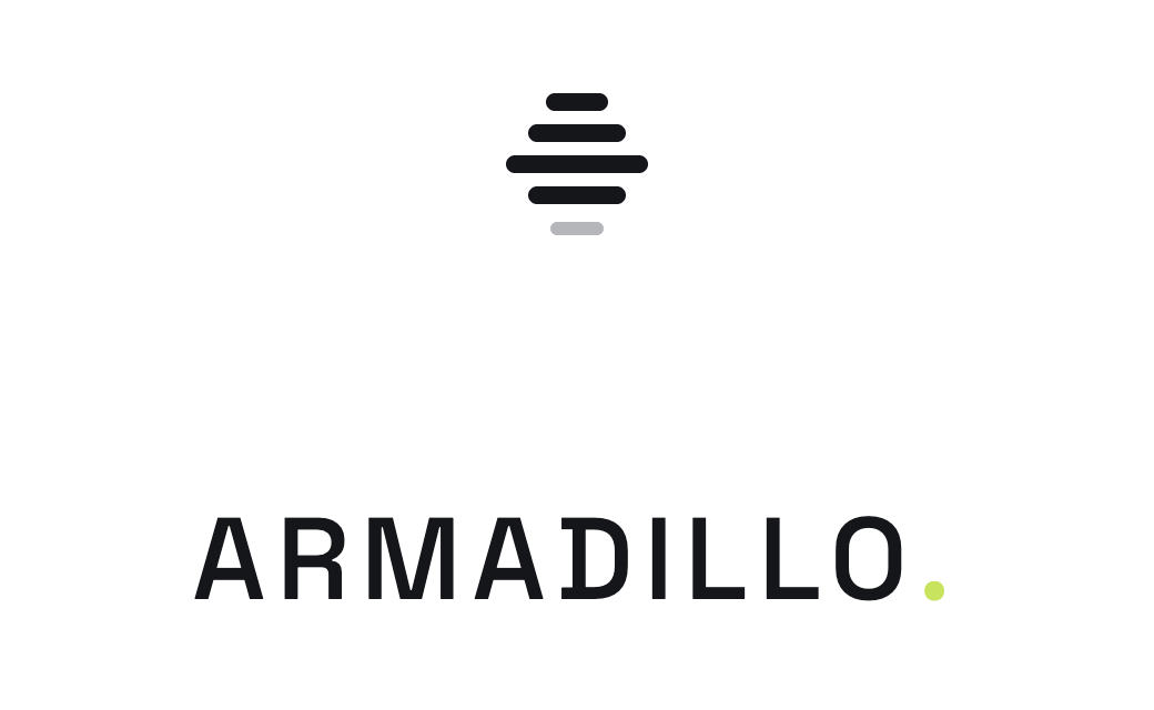
Five horizontal bars taper toward the base — a stylised armadillo in profile, reading equally as a sound-wave or audit ledger. The wordmark always carries a lime green full stop: a single quiet flourish in an otherwise grey system.
The standard signature for product chrome, marketing surfaces, and print. Always horizontal. Icon sits at cap-height of the wordmark.
XS for product chrome (14px wordmark, 18×16 icon). XL for hero billboards. Below XS the lime dot disappears — drop the punctuation rather than render it sub-pixel.
Use the icon alone in favicons, app tiles, social avatars, and any surface below 60×60 px where the wordmark would become illegible. Five bars tapering down — never use a different bar count.
Space Grotesk Medium, +0.13 em letter-spacing, all caps. The lime full stop is non-optional — it carries the brand colour when nothing else does.
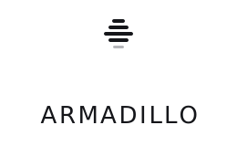
Stack the icon above the wordmark for square crops — login screens, app loaders, social-share images. Centre-align; preserve 1.5× icon-height of breathing room above and below.
Black on light. White on dark. The lime green is reserved for the wordmark full stop and the bottom bar of the icon at large scale.
Minimum clear space equals the cap-height of the wordmark on all four sides. Don't crowd it, don't recolour the dot, don't redraw the bars.